成套陈列道具怎么设计:层次、比例与留白盛艺祥 · 行业资讯
成套陈列道具怎么设计:层次、比例与留白 How display suites are designed: layers, ratios, and breathing room
一套珠宝柜台摆下来,单件道具都好看,拼在一起却显乱——这是很多店调陈列时遇到的怪事。问题往往不在单件,在成套设计:一套道具里谁主、谁副、谁留白,比例怎么分,层次怎么搭,才是决定柜台气质的真正功课。
成套设计的第一件事是定"主角"。一套里只允许一件货当主角,道具围绕它配:主推位用高一点、亮一点的展台,其余位置全部降下来当配角。主角和配角的高度差,控制在十到十五厘米最舒服——顾客一眼锁定主推,又不觉得旁边空。原木咖绒全套橱窗展示套装 DJ06 就是按这个思路排的:主展台居中抬高,侧位递降,绒面颜色统一收束,顾客的视线自然就落在中心点。
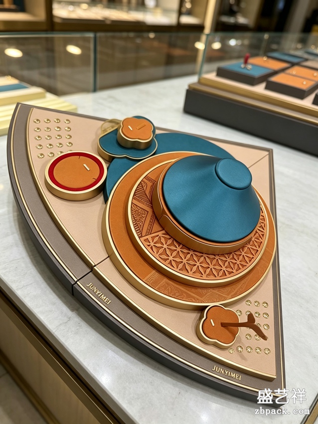
层次是第二件事。从顾客站的位置看过去,柜台的视觉层次要"前低后高、疏密有致":前排放矮托、浅盘,货品贴着手边;后排用立架、错层台,把视线往上引。层次不是把道具从低到高排一排,而是要有"坡":最高点永远对着主推位,左右两侧顺势而下,整个台面像一张画,重心清楚,边角干净。新中式扇形组合珠宝展示台 DJ04 的高明处就在这——扇形排列自带序列感,主位、次位、过渡位一步到位,不用店员每天重新摆。
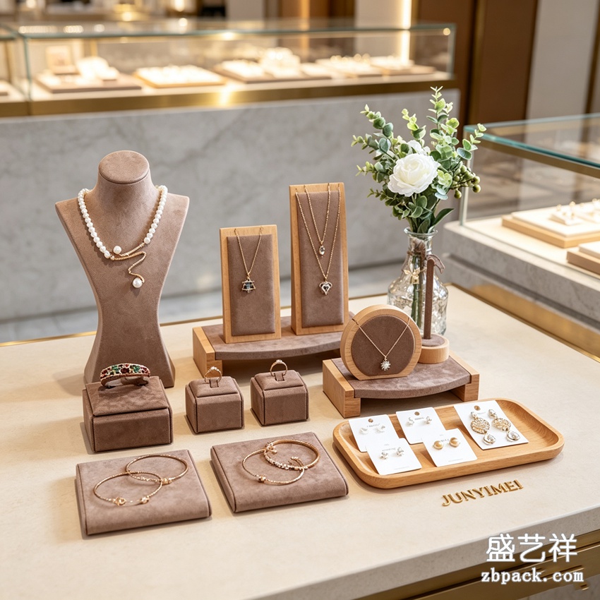 比例是第三件事,也是最容易过头的。一套陈列里,道具占的"体积"和货品占的"体积"大概三七开:货是七,道具是三。道具太多,台面看着富丽,货反而被淹;道具太少,货又像摆在仓库里,显不出价。别小看这七三开——它是个经验底数:橱窗和展柜可以宽松些,四六开;试戴区贴近互动,八二开,货为主、盘为辅。比例定下来,成套道具的采购清单就有了依据,不会买着买着就堆成杂货摊。
留白是第四件事,也是成套设计里最值钱的。柜台的"空"不是浪费,是货品的呼吸:主推位两侧各留出一个小臂宽的净空,顾客的视线才能"落"住——没有留白,满台都是货,反而一件都记不住。留白可以靠三种方式做:一是道具本身的低台面、窄边框,让空位自然透出来;二是托盘和货品之间留两到三厘米的呼吸边;三是位置之间刻意空出的一格,像句号一样让视线停顿。DJ04 的扇形台面、白框米绒组合式展示托盘 TP58 的低边框,都是为留白服务的细节——框越窄,货越有"漂浮"的贵气。
 成套设计还要跟着柜台载体变。台上柜、抽屉柜、橱窗柜、壁挂柜,四种载体四种逻辑:台上柜要"矮而稳",重心低,客人撑手也翻不了;抽屉柜要"扁而深",托盘层层可叠,拉开就是一个小展场;橱窗柜要"亮而透",道具少而精,让灯光替它说话;壁挂柜要"轻而直",垂挂式居多,道具自重不能大。一套道具想要通吃四个载体,最后往往哪个都不顺——成套的意义就是"一柜一配",让每个载体都有自己的那套。
颜色的比例同样讲究。"一套"不是"一整色":六成主色、三成辅色、一成跳色,是陈列配色里最稳的公式。主色跟着货走——金饰配深色底、彩宝配中性底;辅色跟柜台走——木纹、金属、绒面各占其位;那一成跳色留给当季主推,像一句醒目的标语。配色崩掉通常不是单色难看,而是比例失控:辅色抢了主色的戏,跳色撒得到处都是。套装的绒色、边色、木色先定主辅跳,再选单品,怎么买都不会乱。
尺寸的"统一感"也是成套的一部分。一套里的托盘高低差、宽窄差、圆角半径,最好出自同一套设计语言:全是方角,就都方角;有圆角过渡,就都圆角。零零散散的单品拼起来的套装,最吃亏的就是这个——单件看着都对,摆在一起棱角打架。成套道具的真正价值不是"一个款式的一套货",而是"一个口吻的一家人"——工具感、仪式感、亲切感,都要靠统一的口径说出来。
成套设计的验收,有一套"退三步"的办法:摆好之后,人退到三步外,先闭眼再睁眼,第一眼看的是不是主推位?再看三秒,停在自己身上的是不是那件主推的货?最后一个问题:台面上有没有任何一个角落让你觉得"多出来了"?三个问题答得顺,这套设计就立住了;答不顺,别急着换货,先调道具。
说到底,成套陈列道具的设计,是给货品排一出戏:主角是谁、配角几个、舞台怎么搭、哪里留白让观众喘口气。层次、比例、留白三样到位,一套道具自己就会说话——它不是把货摆出来,是让货被人看见。
本文为原创内容,版权归盛艺祥所有。如需转载请注明出处。
盛艺祥(Shengyixiang)——高端珠宝包装设计与定制专家。 A whole jewelry counter set up, every piece of prop looks good on its own, yet all together reads messy — that is the strange thing many shops run into when restaging. The problem is usually not the single piece but the suite: who leads, who supports, who breathes, how the ratios split, how the layers stack — that is the real homework behind a counter's presence. The first job of a suite is to pick the "hero." Only one piece of goods gets to be the hero; everything else arranges around it: the hero position gets the higher, brighter stand, and every other spot steps down to support. A height gap of ten to fifteen centimeters between hero and support feels best — the customer locks on the hero at once without the sides feeling empty. The DJ06 full wood-and-velvet window display suite is arranged on exactly this logic: the hero stand raised in the center, side positions descending, velvet tones unified — the eye settles on the center by itself. Layers come second. From where the customer stands, the counter's visual layering should be "low in front, high in back, even breathing": the front row holds low stands and shallow trays, goods at hand's reach; the back row uses uprights and staggered risers, pulling the eye upward. Layering is not lining props up from short to tall — it needs a "slope": the highest point always faces the hero position, the two sides descend smoothly, and the whole surface reads like a painting, with a clear center of gravity and clean edges. What makes the DJ04 new-Chinese fan-shaped display stand clever is exactly this — the fan layout carries its own sequence, main, secondary, and transition positions settled in one step, no daily re-staging needed.
Ratios come third and overshoot most often. In a display, props should take about thirty percent of the "volume" and goods seventy: goods seven, props three. Too many props and the surface looks lavish but drowns the goods; too few and the goods sit like a warehouse, priced wrong. Do not underestimate the seventy-thirty — it is an experienced baseline: windows and display cabinets can loosen to sixty-forty; try-on zones lean interactive, eighty-twenty, goods first, trays secondary. Once ratios are set, the suite shopping list has a basis and never piles into a bazaar by accident.
Breathing room is the fourth job and the most valuable in suite design. A counter's "empty" is not waste — it is the goods' breath: keep a forearm's width of clean space on both sides of the hero, and the eye can actually "land" — without it, a full counter remembers nothing. Leave room three ways: low profiles and narrow rims on the props themselves, letting negative space show through; a two-to-three-centimeter breathing edge between tray and goods; and one deliberately empty cell here and there, a period that pauses the eye. The fan face of the DJ04 and the low rims of the TP58 white-framed cream-velvet combination tray both serve the breathing room — the narrower the frame, the more "floating" premium the goods read.
A suite also has to follow its carrier. Countertop, drawer cabinet, window case, wall case — four carriers, four logics: countertops must be "low and steady," low center of gravity, safe against a leaning customer; drawer cabinets must be "flat and deep," trays stackable, one pull revealing a little showground; window cases must be "bright and see-through," few and fine props, letting light speak; wall cases must be "light and straight," mostly hanging, low self-weight. One suite trying to cover all four carriers usually fits none — a suite's meaning is "one cabinet, one match," every carrier with its own set.
Color ratios matter equally. "A suite" is not "one color": sixty percent main, thirty percent support, ten percent accent is the steadiest formula in display color. The main follows the goods — gold on dark grounds, colored stones on neutrals; the support follows the counter — wood, metal, velvet each in its spot; that ten percent accent belongs to the season's hero, one loud sentence. Broken color is rarely an ugly single tone but a broken ratio: support stealing the main's act, accents scattered everywhere. Set the suite's velvet, trim, and wood colors as main-support-accent first, then pick pieces — buy anything, and it still holds together.
A "unity of size" is also part of a suite. The height gaps, width steps, and corner radii inside one suite should come from one design language: all square corners, or all square with rounded transitions. Sets assembled from random singles lose the most here — each piece fine, corners fighting once side by side. A real suite's value is not "one style in many pieces" but "one voice in one family" — utilitarian, ceremonial, or friendly, it has to be said in one tone.
Accepting a suite has a "three steps back" method: after staging, step three paces back, close your eyes, open them — is the first thing you see the hero position? Look for three more seconds — is the thing holding your attention the hero piece? Last question: is there any corner on the surface that feels "extra"? Three clean answers and the design stands; if not, do not change the goods first — adjust the props.
At bottom, designing a display suite is staging a play for the goods: who is the lead, how many supports, how the stage is built, where the audience breathes. Layers, ratios, and breathing room all in place, a suite speaks by itself — it does not put the goods out; it makes the goods seen.
This is original content. Copyright belongs to Shengyixiang.
Shengyixiang — your expert in high-end jewelry packaging design & customization.
返回资讯列表
Back To News List
比例是第三件事,也是最容易过头的。一套陈列里,道具占的"体积"和货品占的"体积"大概三七开:货是七,道具是三。道具太多,台面看着富丽,货反而被淹;道具太少,货又像摆在仓库里,显不出价。别小看这七三开——它是个经验底数:橱窗和展柜可以宽松些,四六开;试戴区贴近互动,八二开,货为主、盘为辅。比例定下来,成套道具的采购清单就有了依据,不会买着买着就堆成杂货摊。
留白是第四件事,也是成套设计里最值钱的。柜台的"空"不是浪费,是货品的呼吸:主推位两侧各留出一个小臂宽的净空,顾客的视线才能"落"住——没有留白,满台都是货,反而一件都记不住。留白可以靠三种方式做:一是道具本身的低台面、窄边框,让空位自然透出来;二是托盘和货品之间留两到三厘米的呼吸边;三是位置之间刻意空出的一格,像句号一样让视线停顿。DJ04 的扇形台面、白框米绒组合式展示托盘 TP58 的低边框,都是为留白服务的细节——框越窄,货越有"漂浮"的贵气。
成套设计还要跟着柜台载体变。台上柜、抽屉柜、橱窗柜、壁挂柜,四种载体四种逻辑:台上柜要"矮而稳",重心低,客人撑手也翻不了;抽屉柜要"扁而深",托盘层层可叠,拉开就是一个小展场;橱窗柜要"亮而透",道具少而精,让灯光替它说话;壁挂柜要"轻而直",垂挂式居多,道具自重不能大。一套道具想要通吃四个载体,最后往往哪个都不顺——成套的意义就是"一柜一配",让每个载体都有自己的那套。
颜色的比例同样讲究。"一套"不是"一整色":六成主色、三成辅色、一成跳色,是陈列配色里最稳的公式。主色跟着货走——金饰配深色底、彩宝配中性底;辅色跟柜台走——木纹、金属、绒面各占其位;那一成跳色留给当季主推,像一句醒目的标语。配色崩掉通常不是单色难看,而是比例失控:辅色抢了主色的戏,跳色撒得到处都是。套装的绒色、边色、木色先定主辅跳,再选单品,怎么买都不会乱。
尺寸的"统一感"也是成套的一部分。一套里的托盘高低差、宽窄差、圆角半径,最好出自同一套设计语言:全是方角,就都方角;有圆角过渡,就都圆角。零零散散的单品拼起来的套装,最吃亏的就是这个——单件看着都对,摆在一起棱角打架。成套道具的真正价值不是"一个款式的一套货",而是"一个口吻的一家人"——工具感、仪式感、亲切感,都要靠统一的口径说出来。
成套设计的验收,有一套"退三步"的办法:摆好之后,人退到三步外,先闭眼再睁眼,第一眼看的是不是主推位?再看三秒,停在自己身上的是不是那件主推的货?最后一个问题:台面上有没有任何一个角落让你觉得"多出来了"?三个问题答得顺,这套设计就立住了;答不顺,别急着换货,先调道具。
说到底,成套陈列道具的设计,是给货品排一出戏:主角是谁、配角几个、舞台怎么搭、哪里留白让观众喘口气。层次、比例、留白三样到位,一套道具自己就会说话——它不是把货摆出来,是让货被人看见。
本文为原创内容,版权归盛艺祥所有。如需转载请注明出处。盛艺祥(Shengyixiang)——高端珠宝包装设计与定制专家。 A whole jewelry counter set up, every piece of prop looks good on its own, yet all together reads messy — that is the strange thing many shops run into when restaging. The problem is usually not the single piece but the suite: who leads, who supports, who breathes, how the ratios split, how the layers stack — that is the real homework behind a counter's presence. The first job of a suite is to pick the "hero." Only one piece of goods gets to be the hero; everything else arranges around it: the hero position gets the higher, brighter stand, and every other spot steps down to support. A height gap of ten to fifteen centimeters between hero and support feels best — the customer locks on the hero at once without the sides feeling empty. The DJ06 full wood-and-velvet window display suite is arranged on exactly this logic: the hero stand raised in the center, side positions descending, velvet tones unified — the eye settles on the center by itself. Layers come second. From where the customer stands, the counter's visual layering should be "low in front, high in back, even breathing": the front row holds low stands and shallow trays, goods at hand's reach; the back row uses uprights and staggered risers, pulling the eye upward. Layering is not lining props up from short to tall — it needs a "slope": the highest point always faces the hero position, the two sides descend smoothly, and the whole surface reads like a painting, with a clear center of gravity and clean edges. What makes the DJ04 new-Chinese fan-shaped display stand clever is exactly this — the fan layout carries its own sequence, main, secondary, and transition positions settled in one step, no daily re-staging needed.
Ratios come third and overshoot most often. In a display, props should take about thirty percent of the "volume" and goods seventy: goods seven, props three. Too many props and the surface looks lavish but drowns the goods; too few and the goods sit like a warehouse, priced wrong. Do not underestimate the seventy-thirty — it is an experienced baseline: windows and display cabinets can loosen to sixty-forty; try-on zones lean interactive, eighty-twenty, goods first, trays secondary. Once ratios are set, the suite shopping list has a basis and never piles into a bazaar by accident.
Breathing room is the fourth job and the most valuable in suite design. A counter's "empty" is not waste — it is the goods' breath: keep a forearm's width of clean space on both sides of the hero, and the eye can actually "land" — without it, a full counter remembers nothing. Leave room three ways: low profiles and narrow rims on the props themselves, letting negative space show through; a two-to-three-centimeter breathing edge between tray and goods; and one deliberately empty cell here and there, a period that pauses the eye. The fan face of the DJ04 and the low rims of the TP58 white-framed cream-velvet combination tray both serve the breathing room — the narrower the frame, the more "floating" premium the goods read.
A suite also has to follow its carrier. Countertop, drawer cabinet, window case, wall case — four carriers, four logics: countertops must be "low and steady," low center of gravity, safe against a leaning customer; drawer cabinets must be "flat and deep," trays stackable, one pull revealing a little showground; window cases must be "bright and see-through," few and fine props, letting light speak; wall cases must be "light and straight," mostly hanging, low self-weight. One suite trying to cover all four carriers usually fits none — a suite's meaning is "one cabinet, one match," every carrier with its own set.
Color ratios matter equally. "A suite" is not "one color": sixty percent main, thirty percent support, ten percent accent is the steadiest formula in display color. The main follows the goods — gold on dark grounds, colored stones on neutrals; the support follows the counter — wood, metal, velvet each in its spot; that ten percent accent belongs to the season's hero, one loud sentence. Broken color is rarely an ugly single tone but a broken ratio: support stealing the main's act, accents scattered everywhere. Set the suite's velvet, trim, and wood colors as main-support-accent first, then pick pieces — buy anything, and it still holds together.
A "unity of size" is also part of a suite. The height gaps, width steps, and corner radii inside one suite should come from one design language: all square corners, or all square with rounded transitions. Sets assembled from random singles lose the most here — each piece fine, corners fighting once side by side. A real suite's value is not "one style in many pieces" but "one voice in one family" — utilitarian, ceremonial, or friendly, it has to be said in one tone.
Accepting a suite has a "three steps back" method: after staging, step three paces back, close your eyes, open them — is the first thing you see the hero position? Look for three more seconds — is the thing holding your attention the hero piece? Last question: is there any corner on the surface that feels "extra"? Three clean answers and the design stands; if not, do not change the goods first — adjust the props.
At bottom, designing a display suite is staging a play for the goods: who is the lead, how many supports, how the stage is built, where the audience breathes. Layers, ratios, and breathing room all in place, a suite speaks by itself — it does not put the goods out; it makes the goods seen.
This is original content. Copyright belongs to Shengyixiang.Shengyixiang — your expert in high-end jewelry packaging design & customization.